Best Colors for YouTube Thumbnails: A Real Color-Edit Comparison
Compare real white and navy thumbnail edits, inspect small previews, and try six color palettes with hex codes and checks for text and subject clarity.
Thumbrix Editorial · Published · 8 min read
We asked Thumbrix to remove some camera accessories and keep a blue-purple background. It returned a white background instead. The edit also enlarged the camera until it covered part of the price.
That result changed how we approached this guide to the best colors for YouTube thumbnails. Choosing a palette is only part of the job. You also need to check whether the image retained its subject, lettering, and layout—and whether a color change actually helps at a small size.
Below are real results from our September 14, 2026 design exercise, followed by six palettes you can use as starting points. The exercise used a fictional camera-review idea, not a real product test or a published YouTube experiment.
Our example: a camera and one question
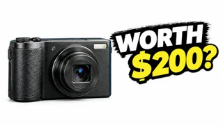
The headline is WORTH $200? The camera is AI-generated and unbranded. We used a local test build of Thumbrix connected to the live GPT Image 2 provider through KIE, with real generation and AI Edit requests.
The first result had a blue-purple background, a warm wooden desk, white “WORTH,” and yellow “$200?” Both lines had substantial black backing. The full creation walkthrough shows the initial prompt and the failed simplification edit.
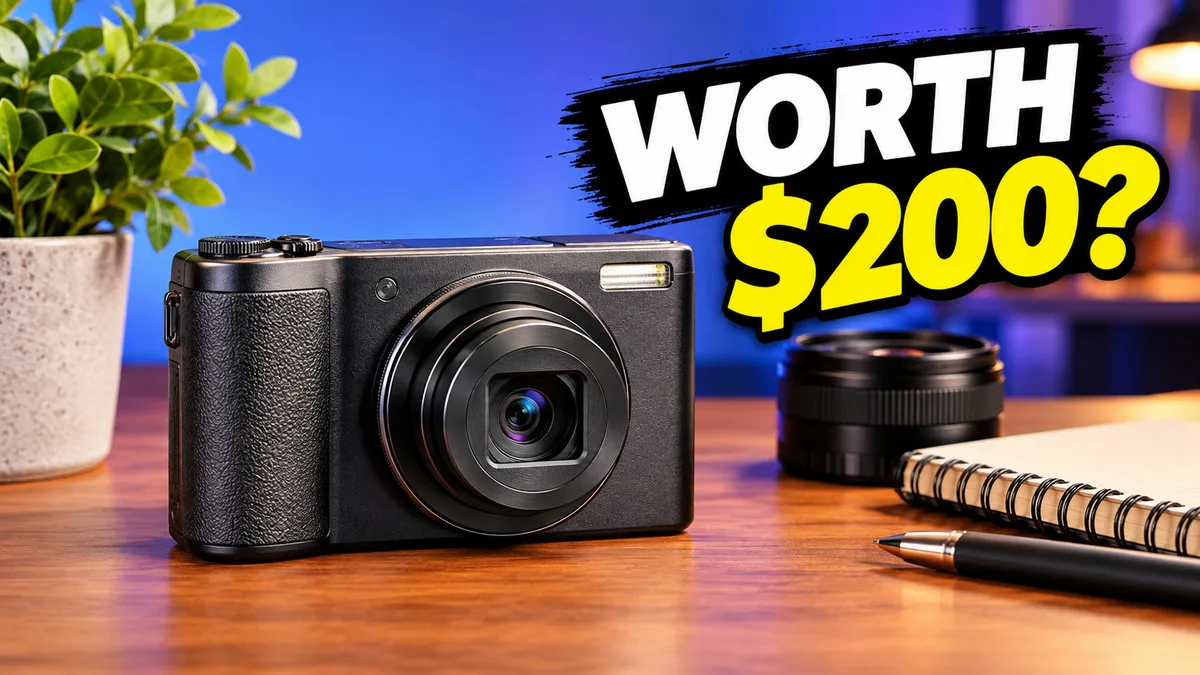
This distinction is easy to miss. Saying “yellow works” leaves out the pixels around it. In this image, yellow sits against black; the bright blue is farther behind. Replacing the blue alone would not tell us whether yellow was responsible for the headline’s readability.
Fix the layout before comparing palettes
Our first edit removed the props but also changed the background to white and pushed the camera into the dollar sign. A cleaner-looking scene had introduced a reading problem.
That image is not a fair color comparison with the original: the camera size and background changed together. We kept it as a failure example, then requested a layout repair. The corrected version became the source for the next color edit.
One source image, two palette directions
Our goal was to compare a dark studio treatment with a lighter treatment while retaining the corrected camera placement and headline. This was an AI edit, not a pixel-locked recoloring operation. We checked the resulting layout as well as its colors.
The corrected source had a white background. The camera sat on the left and the complete question on the right. White gave the black camera a clear outer silhouette, although the black text backing remained a prominent shape of its own.
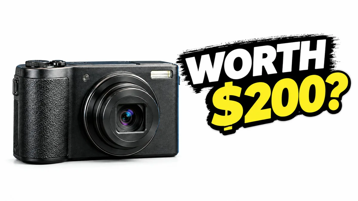
The navy background request
Change ONLY the white background into a deep navy-blue studio backdrop (#172554). The entire surrounding background must be dark navy blue instead of white. Preserve the camera and the full WORTH $200? headline exactly at their current positions and sizes. Keep the same white and yellow letters and black backing. Keep the camera dark with its existing highlights; do not redraw the product. No changes to layout, text, subject size, no extra objects. Only replace the background color.
This time the background changed to navy. The camera remained on the left, the question stayed on the right, and the dollar sign remained visible. At a glance, the composition is close to the source, but we do not treat a generative edit as proof that every foreground pixel stayed identical.
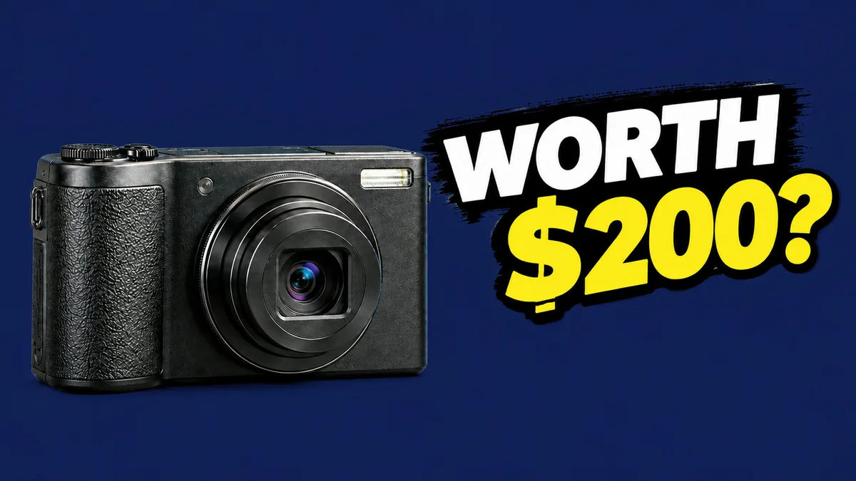
The earlier repair prompt had also requested navy and received white. The narrower request worked here; one sequence does not establish that shorter prompts always perform better. It does show why reviewing the returned image matters more than assuming the instruction was followed.
What changes when the thumbnail is small?
Here are the two versions at 320 pixels wide, scaled down further on narrow screens. Compare the camera outline and the price before looking at surface texture. Texture can be attractive at full size without helping someone recognize the subject in a feed.

At this size, the white version makes the camera’s left and bottom edges easier to pick out. In the navy version, those dark edges blend more with the background. The lens and highlights still identify the camera, while the white and yellow headline remains readable in both because it retains its black backing.
For a thumbnail meant to help a viewer recognize this product quickly, we prefer the white version. The navy treatment provides a more consistent dark studio mood, but that mood comes with less separation around the camera body. Bright letters alone do not resolve that tradeoff.
Our preference is a design judgment about this image. We did not show these thumbnails to a viewer panel, upload them to a channel, or collect CTR data. There is no measured winning color here. The case record includes the exact inputs and file checksums so the process can be inspected.
Six palettes you can adapt
These are starting recipes, not the measured pixel colors of the AI outputs above. The background and main text form the base; use the accent for a smaller area such as a number, label, or product detail. An AI prompt may approximate a hex value rather than reproduce it exactly.
| Palette | Background | Main text | Accent | Check before using it |
|---|---|---|---|---|
| Charcoal and yellow | #0F172A |
#F8FAFC |
#FACC15 |
Does a dark subject still have a visible edge? |
| Navy and orange | #172554 |
#FFFFFF |
#FB923C |
Does the accent support the question or compete with it? |
| Cream and ink | #FFF7ED |
#172554 |
#EA580C |
Are pale objects getting lost against the background? |
| Deep green and ivory | #14532D |
#FFFBEB |
#FDE047 |
Can you read the text over the actual photo? |
| Plum and mint | #581C87 |
#FFFFFF |
#A7F3D0 |
Does the cool accent fit the subject’s natural colors? |
| White and red | #FFFFFF |
#0F172A |
#DC2626 |
Is red restricted to a useful point of emphasis? |
Begin with the photo you have. A cream background might suit a dark camera, but a white plate or pale product needs a different treatment. Natural skin and food colors should not be distorted just to make them fit a palette.
Choose text color against its immediate background
In the original result, the black brush-style backing makes a separate surface for the letters. That is why judging the text against the average blue of the entire image would miss the important contrast relationship.
On a photograph without a text panel, inspect the exact area behind each word. White lettering may work over a shadow but disappear where the same line crosses a window. Moving the phrase to a quieter area can be better than adding an increasingly thick outline.
Check the smallest meaningful character too. In our case, the dollar sign matters: “200” and “$200” do not communicate exactly the same thing. A palette is not successful if its biggest word reads well but a crucial character is obscured.
How to run your own comparison
Choose a source thumbnail whose layout already works. Keep the same headline and subject, then request one new color direction. State what can change and what must remain, but inspect the returned image against the source anyway.
If the edit moves the product, redraws letters, or changes lighting, note that explicitly. You now have two design treatments, not a controlled test of one color. Do not describe the difference as proof that a particular hue works better.
Preview both against light and dark surroundings. Look at the outer edge, the subject outline, and the text. A design can look distinct on your editor’s canvas and blend into the interface where viewers encounter it.
For a real channel, also look at adjacent videos in your topic. Keep recognizable elements of your own style, but do not force every subject onto an identical background. Typography or a recurring accent can provide continuity while the rest of the palette adapts.
Is there a best color for YouTube thumbnails?
There is no single answer supported by this exercise. Yellow was readable with black backing; the failed white-background edit still had a headline problem because the camera covered it. The corrected images needed to be judged as complete compositions.
YouTube’s official thumbnail guidance recommends readable lettering and avoiding overly complex design, while recognizing that audiences differ. It does not give us grounds to turn these images into a universal color ranking.
For your next thumbnail, choose the palette after you can identify the subject and read the whole question. Then compare a small preview. If you cannot explain the practical difference beyond “this one looks brighter,” keep reviewing before changing the channel’s style around it.