How to Make a Good YouTube Thumbnail: A Real Editing Walkthrough
Follow a real Thumbrix thumbnail workflow: the exact prompt, first result, failed edit, and layout repair, with small previews and practical review checks.
Thumbrix Editorial · Published · 8 min read
Our first camera thumbnail was readable. Our first attempt to simplify it was worse: the AI removed the background we wanted to keep and enlarged the camera until it covered part of the price.
That is a useful place to start a guide on how to make a good YouTube thumbnail. A strong result needs a clear idea, but it also needs a review process that can catch a bad edit. Below is our actual Thumbrix run, including the version we rejected and the instructions we used next.
The brief: one buying question
We chose a fictional video idea: a review asking whether a $200 compact camera is worth buying. The proposed video title was “I Tested a $200 Camera for a Week.” The thumbnail headline was “WORTH $200?” One supplies the premise; the other makes the buying question easy to see.
This was a thumbnail-design exercise. We did not test a camera, publish the video, or measure clicks. The camera pictured is AI-generated and unbranded. For a real product review, use your own product photo and make sure the thumbnail represents the actual model.
We ran the images through a local test build of Thumbrix connected to the live GPT Image 2 provider via KIE, on September 14, 2026. The images below are real generation and AI Edit results, not hand-drawn reconstructions. The case record contains the exact inputs and output checksums.
1. Start with a brief you can evaluate
Here is the exact video-description input for the first generation. We entered the headline separately as WORTH $200?, with a 16:9 shape and the default 1080p export option.
A budget compact camera review. Show a generic unbranded compact digital camera on a creator’s desk, with a lens, notebook and small plant nearby. Warm desk lighting with a blue-purple studio background. Photorealistic product photography. The video asks whether a $200 camera is worth buying. No people or logos; this is a concept image, not sample footage from the camera.
The brief names a subject, setting, lighting, and question. It also contains the seeds of a problem: we asked for several props without deciding whether they helped explain the video.
If you are starting your own thumbnail, write the promise before listing decorative objects. “Can this inexpensive camera do the job?” is a useful direction. A list of cameras, plants, notebooks, and lights is only a scene description.
2. Review the first result without inventing problems
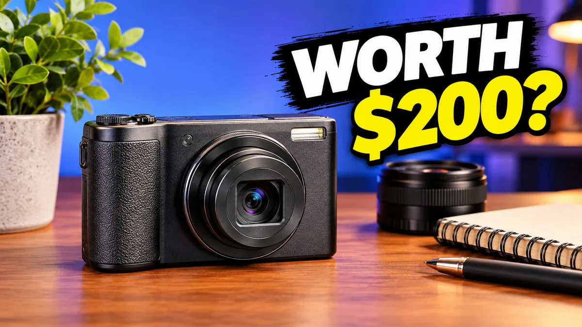
There is plenty to keep here. The headline is correct, its black backing separates it from the background, and the camera is recognizable. The warm desk also makes the scene feel like a creator’s workspace.
The loose lens is less useful. Beside a compact camera, it could suggest an interchangeable-lens setup that this fictional brief never established. The plant, notebook, and pen add atmosphere, but none is needed to understand the buying question.
Our decision was to try a simpler composition. We were testing whether the camera could carry more of the image, not fixing unreadable text. That distinction matters: an edit should have a specific purpose, not just make the image look different.
3. Make a targeted edit—and check what actually changed
We sent the first result into Thumbrix AI Edit with this instruction:
Remove the potted plant, detached lens, notebook, pen and background lamp. Fill their areas naturally with the existing wooden desk and blue-purple studio backdrop. Preserve the same compact camera, its position and recognizable details. Enlarge the camera modestly around its current center to use the freed space without touching the headline. Keep the headline exactly WORTH $200? with its existing wording, font, placement, white and yellow colors and black backing. Do not add objects, logos or new text. Keep the original lighting and 16:9 composition.
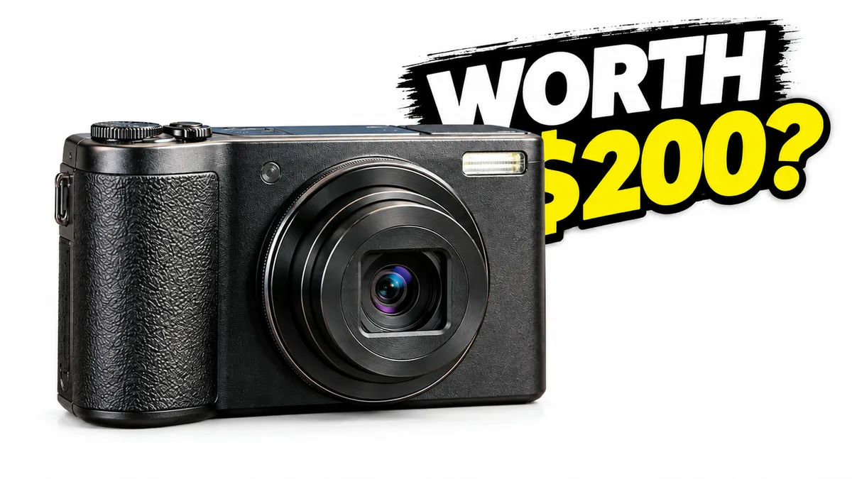
The model removed the accessories. It also removed the wooden desk and blue-purple setting, despite the preservation instruction. The camera became much larger and obscured part of the dollar sign.
We rejected this version. The edit achieved one request while breaking two others. “Keep everything else” is a useful instruction, but it is not a lock on the image.
There is also a lesson in our wording. “Enlarge modestly” leaves the model to decide what modest means. Asking for object removal and a size change together made it harder to isolate the cause. A more cautious next attempt would remove the accessories first and review that result before changing scale.
4. Repair the specific failure
Instead of asking vaguely for a “better” version, we described the overlap and assigned space to the camera and text:
Repair the layout. The camera currently overlaps the headline: shrink the camera and move it down-left so it fits entirely inside the left 55 percent of the canvas, with a clear visible gap before the text. Preserve the camera identity and all existing letters. The full headline WORTH $200? must be completely visible, unchanged white WORTH and yellow $200?, on the right half. Replace the plain white background with a smooth deep navy studio background. Add a subtle cool rim light on the camera edge so the dark body separates from navy. Keep a simple flat desk base, no extra accessories, no plants, no lamps, no logos, no new text. Keep 16:9.
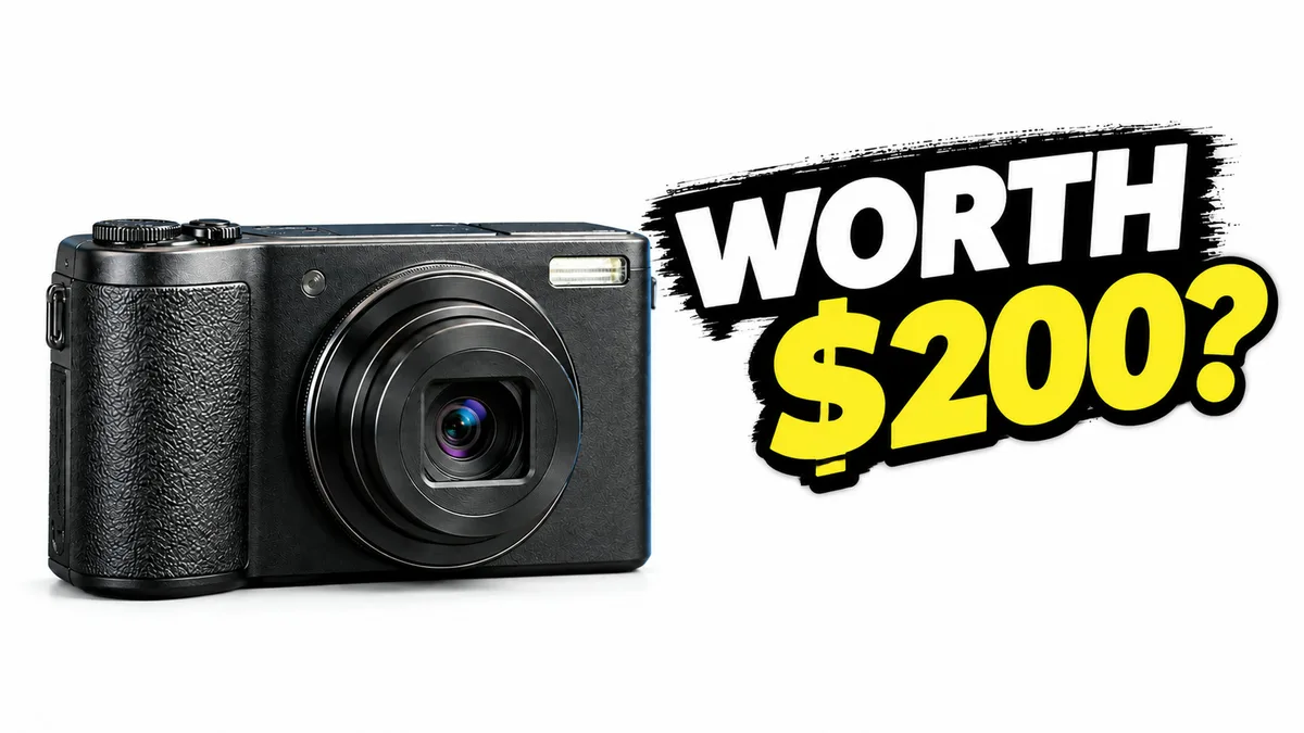
The camera now sits to the left of the question, and the dollar sign is visible. The model also repositioned the text. It did not produce the requested navy background or recreate the original desk setting. We kept this as a usable layout checkpoint, not a fully finished execution of the brief.
The repair had one technical interruption before this result: its first submission timed out and returned no image. Thumbrix marked that attempt failed and returned the local test allowance; we retried that step. That is different from the earlier edit, which completed successfully as a generation but failed our visual review.
5. Compare at the size people will see
A full-width image is useful for checking details. It can hide a problem with hierarchy, though: every object looks impressive when it fills the screen. These previews are 320 pixels wide, or smaller if your screen requires it.
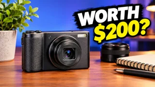
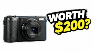
Both versions retain a readable question at this size. In the first, the plant becomes a large green shape at the left edge and the accessories remain visible around the camera. In the corrected version, the camera and question have almost all the space to themselves.
Our preference for this buying-question brief is the corrected layout. It is easier to scan as two elements: product and price. The original has more warmth and a stronger studio setting, which could suit a video about a creator’s setup. Simplifying the image involved giving up that context.
This is an editorial comparison, not a YouTube A/B test. We can inspect whether a letter is covered and whether the subject is visible. We cannot infer a click-through-rate increase from those observations.
6. Check the exported file
Thumbrix exported these images at 1920×1080. Its default export pipeline can resample the provider image, so those dimensions are not a claim of native model detail. The article uses compressed WebP copies; the small previews are separate 320×180 derivatives.
Open your download before uploading it to YouTube. Read the entire headline, check the product shape, and inspect the edges. Important details should stay clear of the lower-right duration overlay area. Our thumbnail size guide covers upload specifications separately.
For color decisions, the companion palette comparison continues with the corrected image. It shows what happened when we requested a navy background while trying to keep the layout.
What we would do differently next time
We would leave the loose lens out of the first brief. We would also separate object removal from subject resizing, then check the dollar sign before accepting any edit. Those are concrete changes to the process that this run exposed.
Our checklist now starts with three questions: Did the edit accomplish its requested change? Did it preserve the things we named? Does the small version still communicate the same promise?
YouTube’s official thumbnail and title tips support the broader principles of readable text and uncomplicated design. This run supplies the part a general rule cannot: a clear headline can become partly hidden during an otherwise plausible edit. Keep the source, compare the result, and reject a revision when it makes the promise harder to read.